The Data Center
DAISI Platform and Brand Design


What Matters
- Established a clear, unified identity for DAISI that connects data, people, and impact, strengthening how the platform is recognized and trusted
- Built a visual system that supports confident decision-making and reinforces the platform’s role in driving awareness and funding
- Carried the identity through the product experience, creating consistency that helps users move seamlessly from exploration to communication and action
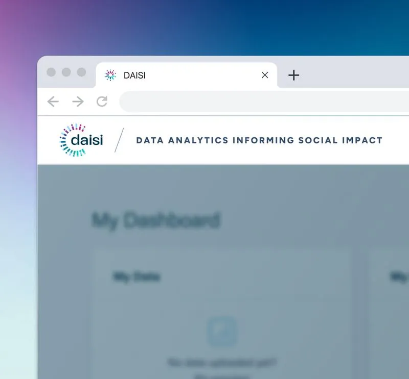
Why Daisi
The Data Center supports leaders across New Orleans with research and analysis that informs real-world decisions. DAISI was created to help decision-makers explore public data and communicate insights that drive awareness and funding.
The identity needed to reflect both the rigor of the data and the people behind it, bridging analysis and human impact.







Designing a Multi-Layered Mark
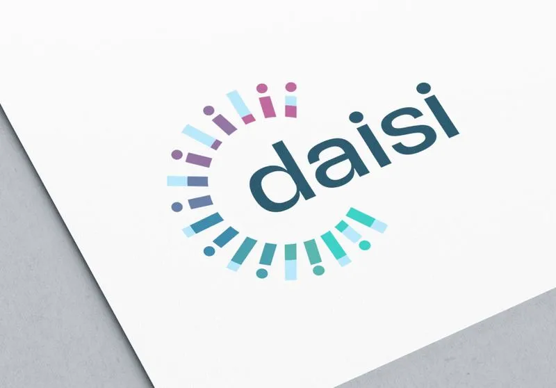
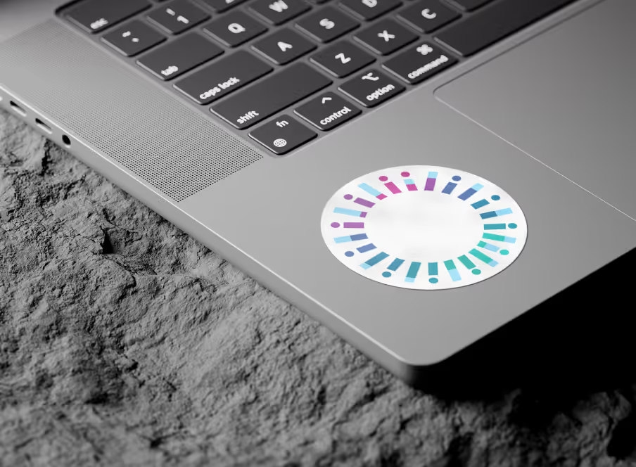
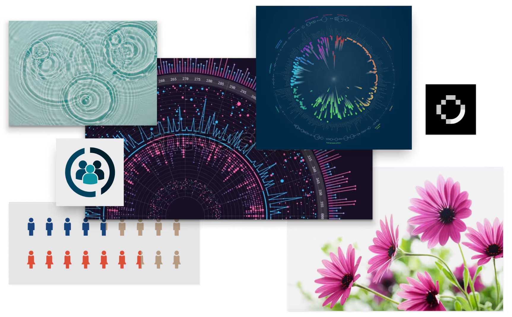
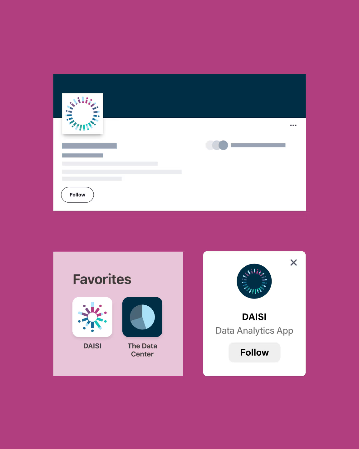
We designed a symbol that works on multiple levels. Its radial form references a daisy interpreted digitally, while color bars echo data visualization. Dots and bars also represent people, reflecting the communities behind the data. The result is a mark that connects analytical structure with human meaning, making the purpose of the platform legible at a glance.
Building a Usable System
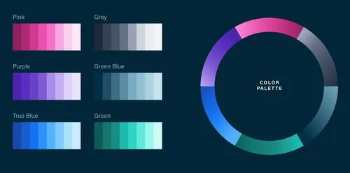
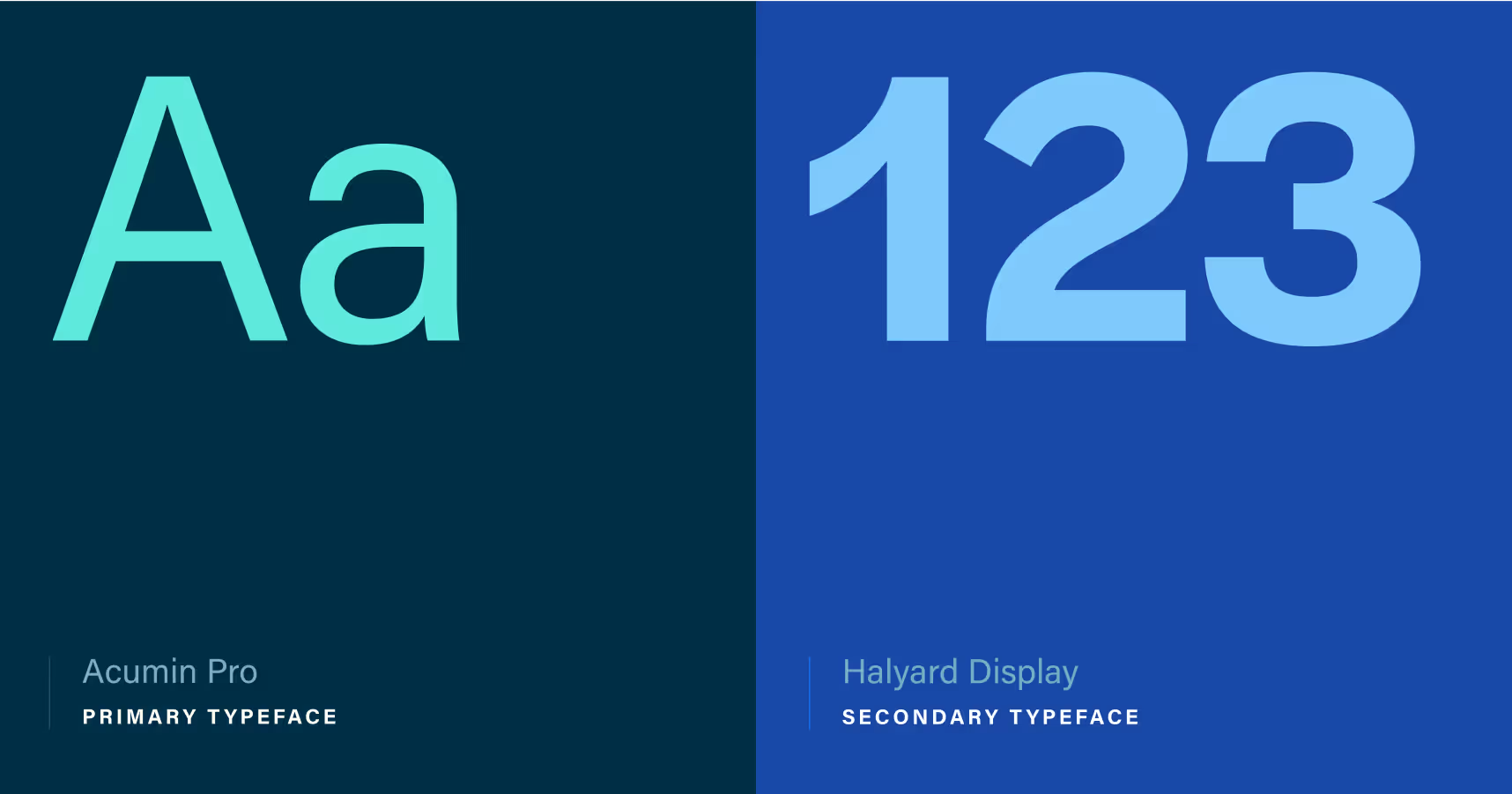
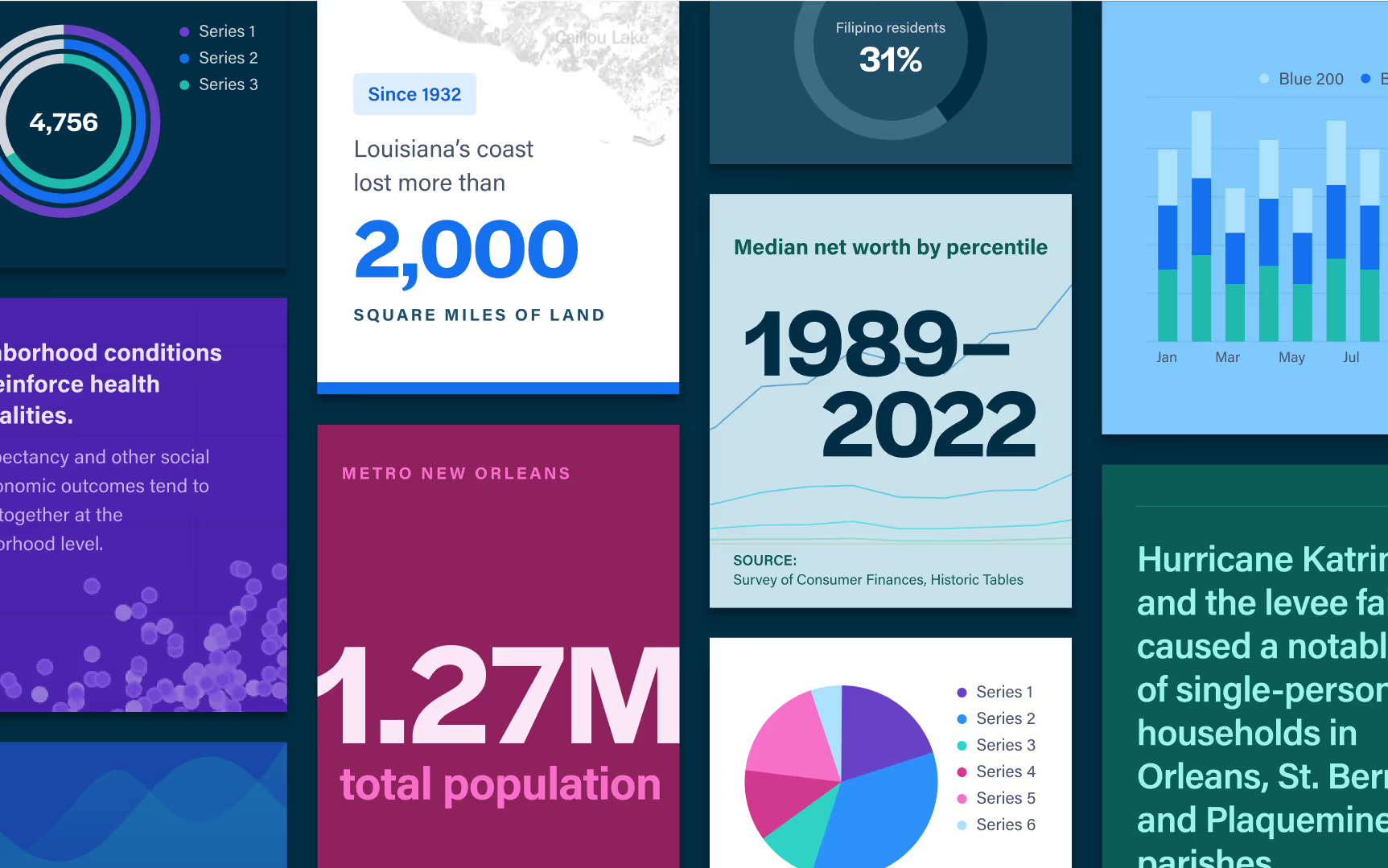
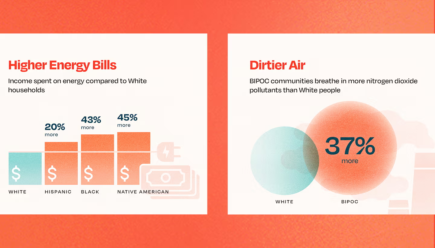
We defined a visual language that extends beyond the mark into color, typography, and interface elements. Charts, filters, and navigation patterns reflect the same system, helping users move between data exploration and communication without friction. By designing brand and product together, the experience feels cohesive from first impression to interaction.