If you’ve ever tried to summarize a 60-page research study into a tweet or explain clinical trial results to a local community partner, you know the challenge:
Science is deep.
Data is dense.
People are busy.
As nonprofit communicators, we sit at the intersection of complexity and clarity. Our job isn’t to dilute important information but to help people see why the information matters, how it connects to their lives, and what action or understanding should follow.
Whether you're working with public health data, climate research, education policy, or neuroscience breakthroughs, the challenge is the same:
How do you make it meaningful? Here are some steps you can take:
Start With the "So What?"
Before you dive into language or layout, take a step back and ask:
Why does this matter to the people we serve or want to engage?
It’s not about "dumbing down" the science. It’s about pulling forward the part that’s relevant.
- Does the research solve a real problem people are facing?
- Does it reflect what people are seeing or dealing with in real life?
- Does it correct a common misunderstanding or outdated assumption?
Start there. The context helps people care.
Try this: Before writing, fill in this sentence:
“This matters because ______. It helps people ______.”
If you can’t fill in those blanks in plain language, the message probably isn’t ready.
Use Everyday Language Without Losing Integrity
You don’t need a Ph.D. to understand complex ideas. But you do need clear, human language.
- Replace jargon with familiar words: “neurodegeneration” → “brain cell loss”
- Define technical terms with a metaphor: “Think of mitochondria as the batteries of the cell.”
- Use short sentences. Active voice. Real-world analogies.
Respect your audience’s intelligence. Just don’t make them work harder than they have to.
Try this: Use the “explain it to a high schooler” rule. If a smart 17-year-old wouldn’t get it, revise. There's a principle we like to use here at 3rd Edge that says, "Don't make me think."
Lead With a Story, Then Support With Data
People connect with people. Start with a human-centered story that embodies the research. Then add data as context—not the other way around.
Example:
“When Gloria’s memory began slipping, her daughter didn’t know where to turn. But a new diagnostic tool could help families like hers detect Alzheimer’s earlier.”
[Then explain the tool and the research behind it.]
The story earns attention. The data builds trust.
Try this: Pair each major research takeaway with a mini case study or composite story. Let readers see the human in the headline.
Use Visuals to Show (Not Just Tell)
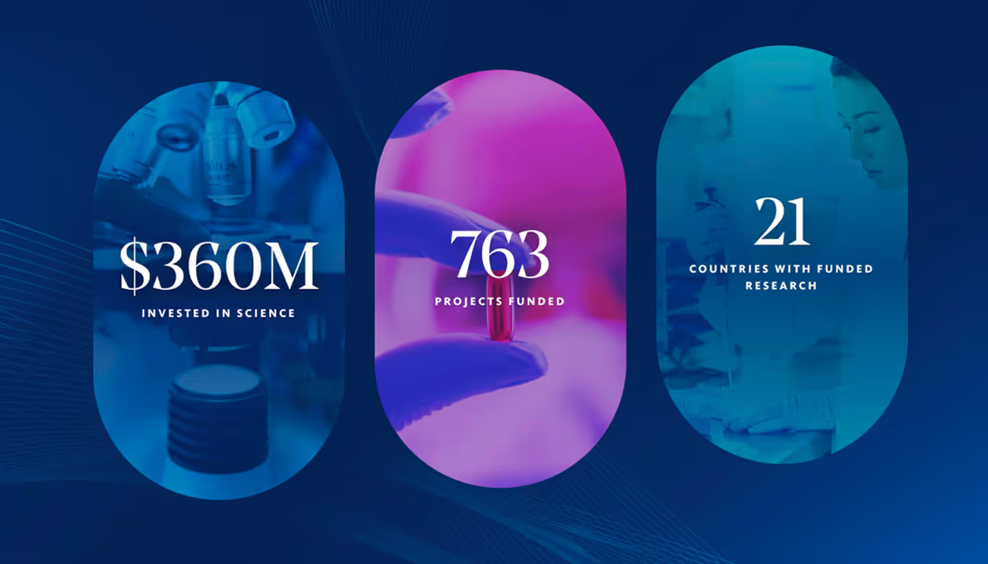
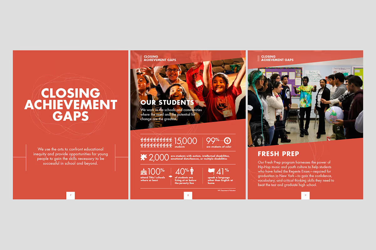
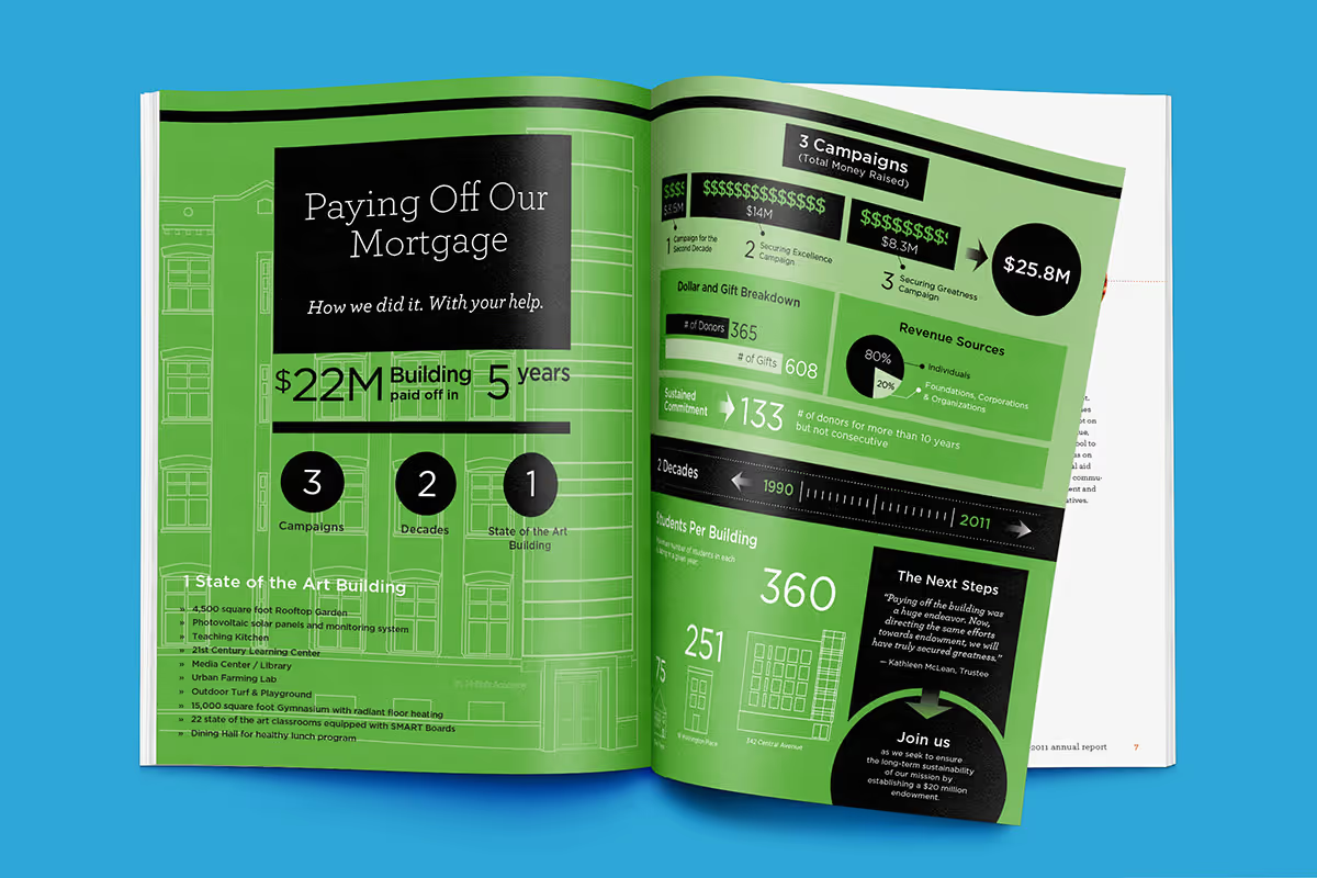
Data tables and bar charts can be overwhelming. Infographics, icons, and simplified visuals help people see patterns, not just numbers.
- Use bold call-outs to highlight key stats
- Break long findings into bite-sized cards or slides
- Use visual metaphors (e.g., a funnel, bridge, or path) to explain processes
Try this: Turn a dense section of your report into a one-page “key insights” snapshot—designed more like a social post than a white paper.
Test Your Message With Real People
If your content only makes sense to the people who wrote it, it’s not ready. Get outside the research bubble.
- Ask program staff how they would explain it
- Run messaging by community advisors, program staff, or people who are familiar with the issue firsthand
- A/B test language in emails or social posts to see what resonates
Try this: Include a 1–2 sentence summary at the top of each research post. Track which ones get read, shared, or clicked on.
Match the Message to the Medium
Not every insight needs a 2,000-word article. Sometimes, the best way to communicate a finding is:
- A 30-second video
- A tweet thread
- A text message blast
- A flyer in three languages
- A community meeting with a handout
Start with the audience, not the format.
Try this: Repurpose the same insight across 3 formats: one long, one short, one visual. Track what gets the most engagement—and use that to inform your strategy.
Conclusion: From Data to Dialogue
Research doesn’t speak for itself. People do. As nonprofit communicators, our role is to act as translators—not just of information, but of meaning.
When we connect the dots between complexity and community, research becomes easier to understand, data becomes more useful, and people are better equipped to ask questions, weigh options, and take informed action.
Further Reading
Health Literacy Online – Office of Disease Prevention and Health Promotion